
Do you know who the man with the hard-to-read name François-Joseph Leclerc du Tremblay was? We’ll bet our heads that almost everyone knows his nickname. But we’ll give you a hint instead: this French Capuchin friar had a huge behind-the-scenes influence on the government of Louis XIII. And, among other things, he dressed in the grey robe attire of his religious order … As you might guess, he was nicknamed “éminence grise” (grey eminence).
Content is not the real king
But why are we bothering you with this historic digression? Marketing people keep on repeating that “content is king”! And it’s true that you have no chance in business without high-quality content – you won’t attract anyone, won’t sell anything and, above all, won’t earn anything.
But few realise who is really pulling the strings. It is definitely typography that is the grey eminence of all content! You can have the best content and perfect graphics, but if you make an enemy of typography, your throne will crumble like a house of cards. Yes, this is the power typography has.
Who’s hiding under the hood?
Typography is a discipline that puts your content in royal clothes. It deals with the selection of the font, its sensitive use and clean typesetting. It plays a crucial role in making your content easy to read and attractive enough, professional and, therefore, trustworthy for your readers.
The ten commandments of grey typography
Always follow the principles of professional typography. It’s a bit of a boring topic, but if you serve your readers, visitors or buyers a perfectly legible text in addition to good content, you will have them “eating out of your hand”.
We have selected 10 main principles for you that you should start to take seriously when creating texts:
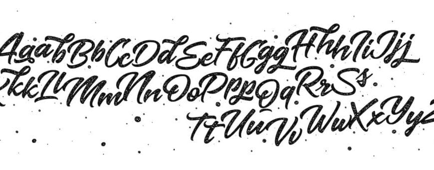
1. Font selection
Whole textbooks are written about the correct font selection. The serif font is used, for example, by The New York Times, while the sans serif font is used by CNN. You need to cleverly tailor the font to your target audience to suit your style and inspire confidence.
2. Font size
Be very careful not to use letters which are too small or too large. It is also good to scale the font size according to the importance in the text (headings, subheadings, body, etc.). In the digital age, it is also necessary to fine-tune the font size “the laboratory way” for display on various devices – for mobile phones approx. 14 to 16 px and for desktop approx. 16 to 22 px.
3. Line length
You can have the perfect font in the ideal font size, but if you give your readers a text “from sun-up to sunset”, they will suffer every time they go to the next line. The ideal line length should be between 45 and 80 characters, including spaces. A good example of great readability is usually the tabloid media. Learn from them!
4. Line height
Lines stuck too close to each other create chaos in the reader’s mind. On the other hand, lines that are too loose disrupt the flow of reading. You should follow the rule that the longer the line or the smaller the font, the greater the line height should be. You can always use the following formula for calculating line height: 1.4 to 1.6 times the font size.
5. Letter-spacing
Letter-spacing refers to an adjustment to the spacing of the individual letters in words. The same rule applies here as in the case of line height. Bad settings significantly affect the readability of the content. Go easy on wider spacing. You can use it, for example, with one-word H E A D I N G S, but otherwise forget it.
6. Contrast
Since the invention of the printing press, no new Johannes Gutenberg has come along with a better idea than black writing on a white background. If your graphic designer tries to convince you otherwise, let them go hungry and thirsty in a tower for a few days. And then ask them again …
7. Structure
A clear text structure is created not only by headings, leads and individual paragraphs. You can also highlight words using bold, italics, underlining, colours, and so on. Not only will your readers appreciate the clarity of the text, but you will also be better placed by search engines.
8. Capital letters
If you want to emphasise something in the text, be sure not to use capital letters. They are very difficult to read. Again, you can use them, for example, with a free-standing, EASY-TO-READ heading.
ANY LONGER TEXT WILL BE TERRIBLE TO READ BECAUSE THE READER WILL GRADUALLY BECOME LOST IN IT UNTIL THEY GET LOST COMPLETELY.
9. Original fonts
If you’re not Google or can’t pay for a professional type founder, don’t even think of creating your own typeface and play it safe. Arial, Verdana or Georgia are tried-and-true fonts that will never offend any reader.
10. Font combinations
A simple rule that applies more in typography than elsewhere: the less, the better. On the web, you often only need one font. If you are visually really capable, you can add one more. Every additional font added will put you in the jail of illegibility.
We know both the kings and all the ministers
At JennPro, of course, we maintain above-standard relationships not only with the kings. We also have a major influence on all behind-the-scenes battles. Well-created content dressed in thoughtful typography is the standard of all our work.
Contact us and enter the typographic “high society”!


