

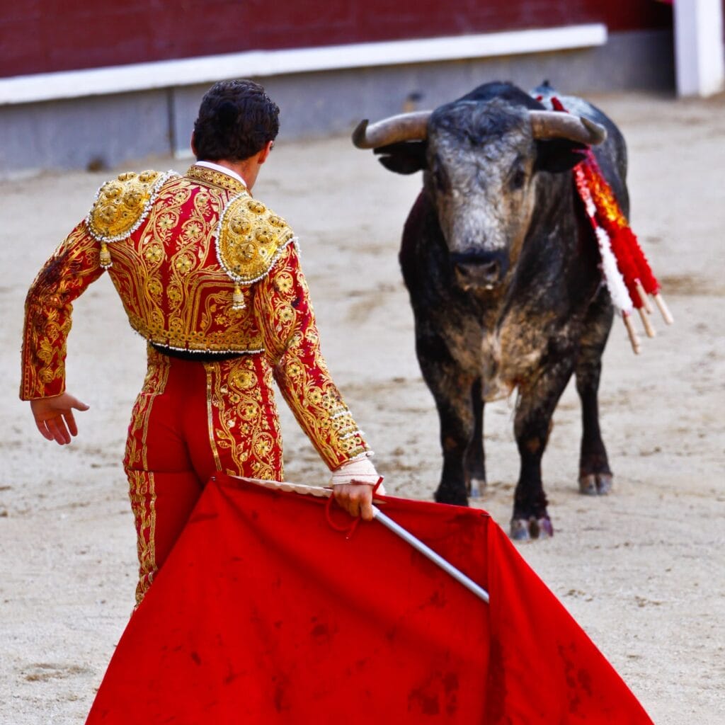
The main symbols of Spanish corrida are definitely a jet-black bull, a torero (not a toreador!) in an ornate suit and, of course, a deep red muleta. And it is this red fabric that is associated with perhaps the greatest myth of this tradition. The red colour in the bullfighter’s hands doesn’t excite the bull at all. Bulls, like most other mammals, don’t distinguish colours the way humans do.
Nowadays, we can only speculate whether Francisco Romero, one of the founding fathers of bullfighting, chose the red fabric due to his ignorance of bull biology or in order to draw the audience’s attention to his performance even more. In any case, in marketing terms, he got his audience’s taste exactly right by choosing red.
Designers and their sharp sword
Colours and their mutual harmonisation influence how people perceive a surrounding space and what things they pay attention to. Research has shown that 90% of customers get a first impression based on the colours used. For 85% of customers, colour is the decisive criterion for purchasing. And you can increase awareness of your brand by up to 80% with the colour you have chosen.
Those are the key figures! But only really good graphic artists and designers are aware of how sharp a tool they hold in their hands.
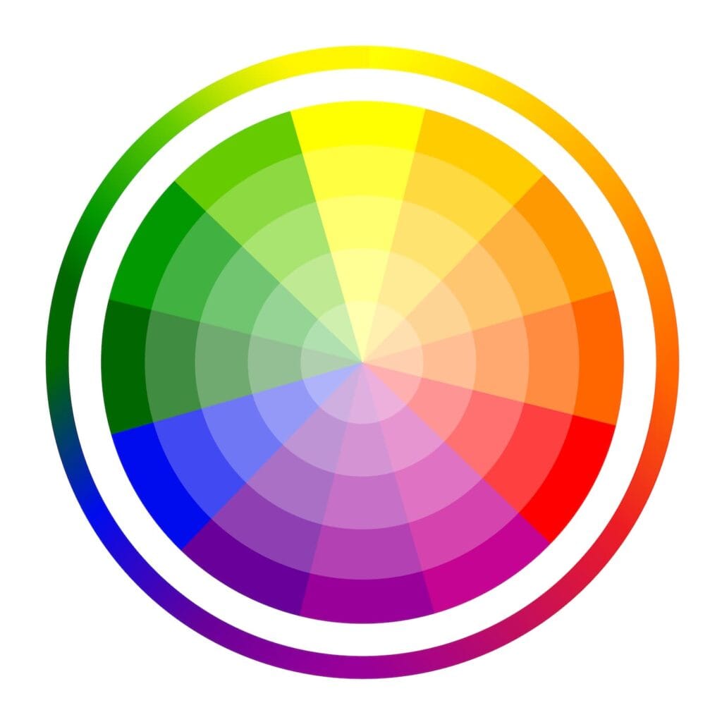
Arena of 12 basic colours
It doesn’t really matter that the human eye can distinguish up to 10 million colours. The reality is much simpler. The basic palette contains 12 colours (see the colour wheel in the picture).
There are three primary colours – red, yellow and blue. There are also three secondary colours – purple, orange and green. And the remaining colours are a combination of the colours that are adjacent to each other – such as yellow and orange.
Which colours excite your audience?
There are colours that are symbolically or very similarly perceived by all people in the world. However, some cultures differ in the details. This is usually influenced by the specific historical experience or geographical location of the country and its climate.
For example, in Spain, but also in Italy or Greece, people prefer warm and lighter colours. On the contrary, Swedes, Norwegians or Finns are known to like colder shades.
Let’s take a closer look at some basic colours:
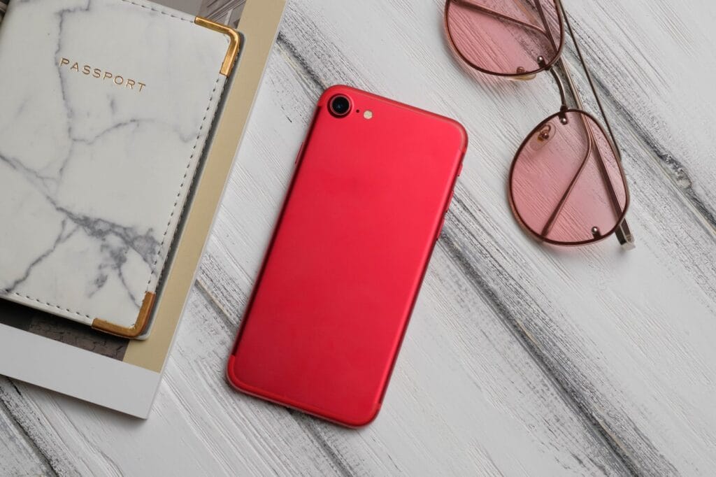
Red as blood
Red attracts attention and is associated with love, energy, war, power or passion. This colour has a very strong vibration and definitely won’t be overlooked. In addition, if you are offering something strong and powerful, such as a Ferrari, your presentation will be extremely effective. However, the colour red is often also used in retail for news and discounts, which should draw attention to the current offer.
Yellow as the sun
Yellow is the lightest colour on the colour wheel and is often associated with happiness and joy. It inspires hope or trust in us. Big brands like to use it to establish a friendly and open relationship with their customers and to be perceived positively by them.

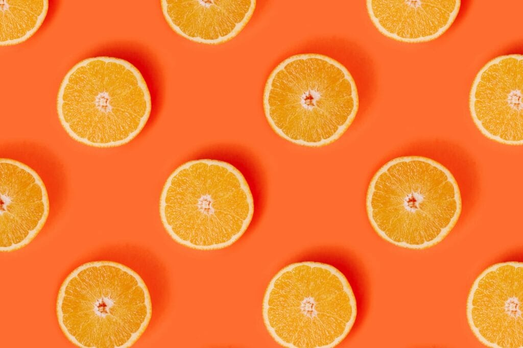
Orange as an orange
The orange colour symbolises revival or adventure. It has one big advantage – it is not as dominant as red and offers a more balanced dose of energy. It is a colour that is strongly social, so it is part of many extroverts’ wardrobes.
Blue as the sky
Given what we have said so far about the psychology of colours, it is surprising that Mark Zuckerberg chose blue for his life’s venture. Blue inspires peace, trustworthiness and loyalty in people. That’s why it is popular with banks and the financial sector in general. The explanation is simple: the founder of Facebook sees a bit like a corrida bull – as he is partially colour-blind, he finds blue the easiest to recognise.

Green as a forest
No colour is more connected with nature than green. Green gives life, inspiring harmony and inner peace in our brain. At present, it is chosen mainly by brands that focus on natural products.

Pink as cheeks
Pink is a relatively tricky colour that requires a good context and balanced use. Even in the Western world today, it is no longer perceived as a purely feminine colour. There are actually brands that thoughtfully use it for their predominantly male audience. The fact is that this colour inspires optimism and harmony in people.
Purple as lavender
Purple can be found in many forms in nature and it always makes an impression. Purple is a great colour if you want to highlight a certain grandeur, wealth and wisdom. It is also popular with artists – they like to use it to underline the quality and uniqueness of their work.

Black as the night
Although the colour black is associated with sadness, death or darkness in almost all cultures, it has an almost magical power to be a symbol of luxury, quality and sophistication. That’s why black is the dominant colour in the car fleets of statesmen and important businessmen! It will also very effectively support the sale of your luxury goods.


